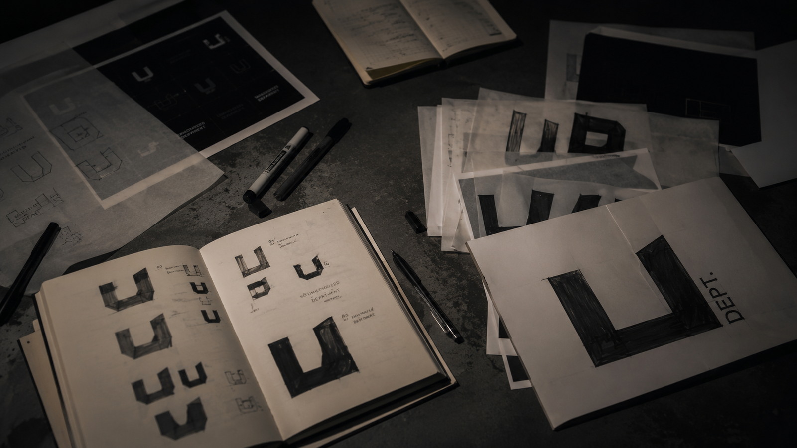
A brand identity rarely begins as a complete system. It begins with a name written repeatedly until one version starts to feel different from the others.
UNAUTHORIZED DEPARTMENT developed through this process: marker sketches, rejected letterforms, technical wordmarks, graffiti references and attempts to reduce the entire name into two letters.
THE NAME CAME FIRST
Unauthorized carried the correct meaning before it had the correct form. The word needed to feel independent without becoming aggressive, automotive without becoming a racing logo and contemporary without relying on a temporary trend.
Early versions leaned too heavily toward one influence. Some appeared too digital. Others looked like conventional streetwear. A few had energy but lacked the structure required to exist across clothing, a website, documentation and physical membership material. A logo cannot be judged only as a single image. It must survive repetition.
THE TECHNICAL WORDMARK
The primary wordmark introduced a more controlled direction. Its movement references automotive scripts and hand-drawn lettering, but the form remains clean enough to work in black and white. The double outline gives the mark presence without requiring texture, chrome or effects.
This version became the main public signature. It works on the front of a garment, across a website header and as a large exterior graphic. The objective was recognition before decoration.
THE EXTENDED MARK
The addition of DEPARTMENT changed the meaning of the name. Unauthorized could have remained the title of a clothing project. Unauthorized Department suggested an organisation, an archive and a system with its own internal language.
The extended mark became useful where the full identity needed to be understood immediately. Spacing, scale and hierarchy became as important as the original lettering.
THE GRAFFITI RECORD
The graffiti logo preserves the less controlled side of the project. Handstyle lettering, stars and gestural elements introduce the human energy missing from the technical wordmark. It is not designed to replace the primary identity. It exists as a secondary record.
The contrast between precise and expressive marks reflects the wider Department: structured systems documenting cultures that are rarely completely controlled.
THE UD MONOGRAM
Reducing the identity to UD created a different problem. The mark needed to be compact without appearing generic. The letter D had to remain recognisable and could not be confused with a B. Unnecessary extensions and decorative stems weakened the symbol.
The final direction uses a direct uppercase construction designed for small spaces: profile images, labels, member cards, favicons, packaging and internal interfaces. A monogram is successful when it feels inevitable rather than abbreviated.
IDENTITY AS A SYSTEM
The four marks do not compete with each other. Each performs a different function: the primary wordmark is the public signature; the extended wordmark provides complete identification; the graffiti mark preserves the expressive cultural record; and the UD monogram is the compact operational symbol.
Together they create a system capable of changing tone without changing identity. The process is not finished, but the foundation is now controlled. The name no longer exists only as writing. It operates as a Department.